
Overview
This is where it all started. In 2022, as a college project, I rebuilt Wonderful Indonesia, the country's official tourism website, using Bootstrap. It was the first thing I ever built, with one goal: learn how a real, content-heavy site fits together by building it myself.

Why a clone
Tutorials teach components one at a time. A card here, a navbar there. What they do not teach is what happens when you combine them: a full-screen carousel sitting on top of a scrolling row of categories, a photo grid next to a newsletter banner, a navigation bar that has to survive every screen size.
A real site forces those questions. I picked Wonderful Indonesia because it is polished, image-heavy and full of different section types. Copying it closely meant I could not skip the hard parts, and I could always compare my version against the original to see where I was wrong.
What I built
- A hero carousel with headline stories, such as G20 Indonesia 2022 facts, a "Baca Selengkapnya" (read more) button and topic shortcuts along the bottom.
- A row of circular story categories, such as Mandalika, Bali and Lombok.
- A "Destinasi Pilihan" (featured destinations) grid: Danau Toba, Borobudur, Mandalika, Labuan Bajo, Likupang, Bali, Raja Ampat, Morotai, Tanjung Kelayang and Jakarta.
- A "Cerita Petualangan" (adventure stories) section.
- A newsletter sign-up banner offering a free travel e-book.
- A navigation bar with search, a language label and a light/dark toggle, plus a floating action button.
- A responsive layout that collapses cleanly on mobile.
What it taught me
How a grid actually works. The carousel, cards and navbar all come from Bootstrap's grid and components. Building them into a full page showed me how rows, columns and breakpoints combine into a responsive layout, which is knowledge I carried straight into React and Next.js.
Text over photography is hard. A tourism site is mostly large hero images and photo cards, with headlines on top. Keeping that text readable over photos I did not control was my first real lesson in contrast, overlays and hierarchy.
Structure before style. The fastest way to rebuild a complex page was to map its sections first and style them second. I still work that way.
GAPA Tetris
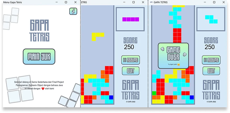
From the same college years: GAPA Tetris, a Tetris game I wrote in Java as the final project for the Object Oriented Programming course in 2023. Where the Wonderful Indonesia clone taught me layout, Tetris taught me to think in objects: pieces, a board and a game loop, each with its own responsibility. The source is on GitHub.
Where it led
This is the first project in my portfolio, and it is here on purpose. The habits I picked up rebuilding a content-heavy site, such as mapping structure first and designing around large imagery, are the same ones I later used on the UNAI websites. It is where the rest of this list started.